pjur Wins Brand Development Of The Year Award
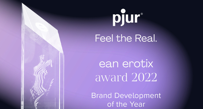 Premium lubricant manufacturer pjur was announced as the winner of the ean EROTIX Award for “Brand Development of the Year” at this year’s\ eroFame in recognition of its bold decision to take the brand in a new direction with a complete redesign.
Yellow and black are the colours traditionally associated with pjur – but since the branding refresh, pjur has acquired a new logo, a new claim, new imagery and new colours. The new pjur logo retains the famous yellow dot but has been updated for a more modern and relevant look. This is supported by the claim “Feel the Real.”, which encapsulates the new values that pjur now wants to convey: self-determination and self-fulfilment. The new colour gradients of the fluid shapes in purple, blue, turquoise, yellow and red complete the established pjur colour spectrum and give the brand a fresh new aesthetic. The new shapes are a visual representation of diversity and openness, fascination, lightness and limitless dreams.
“We’re very pleased to receive this award, as it shows us that we’ve been on the right track with all the work we’ve done over the past two years to sharpen up the core brand message, values and aesthetic, as well as our future brand communication”, says Alexander Giebel, CEO & founder of pjur.
Explore the brand’s new look at: www.pjur.com
About the Author

admin
YNOT Admin wields his absolute power without mercy. When he's not busy banning spam comments to hell he enjoys petting bunnies and eating peanut butter. He recommends everyone try the YNOT Mail (ynotmail.com) email marketing platform and avoid giving their money to mainstream services that hate adult companies.
Related Posts
-
pjur expands brand presence through cooperation with Magasin du Nord in Denmark
Pjur continues its successful retail strategy and, in cooperation with Magasin du Nord, is showcasing selected products in the top three flagship stores of the […]

pjur Is Official Sponsor of the SEX NOW Exhibition in Düsseldorf
pjur is an official sponsor of the SEX NOW exhibition at the NRW-Forum Düsseldorf, bringing the brand and its products into an open dialogue about […]
-

30 Years of pjur: Anniversary Window Display Campaign at Prowler in Soho
pjur and ABS are continuing their successful partnership with a high-impact window display promotion in collaboration with Prowler in Soho, London. On site, customers can […]

pjur Shows Strong Presence During Pride Season in Germany
Once again this year, pjur is proudly joining Pride Season with a strong presence and a powerful message. In close collaboration with 32 organizations, including […]
Comments are closed.