The Importance of Banner Type and Color

YNOT EUROPE – In a previous article, we saw how to place a banner in the best manner possible to maximize its profitability. Today we dedicate ourselves to a complementary aspect that is equally important: the color to use for advertisements.
Every self-respecting website should be designed as if it were a sort of magazine. The user is the reader, who browses the pages, reads the articles and decides, based on the content and style with which the magazine is designed, whether they should read that publication again in the future or try others.
Color and type are of key importance because they can convice users to spend money, but if used haphazardly or too heavily, they can lead to counterproductive effects. Professional services for the supply of advertising often will let you customize the color and the type of banner.
Type: Be careful when choosing between text and mutlimedia banner ads; that is, advertisements containing pictures and short videos. In general, the second type will attract more attention from the reader, but banners take up more space. It is also important to note that multimedia banners require a greater amount of bandwidth and can weigh down the loading of a page. They usually are available in a limited number of sizes, so special spaces may have to be made to accommodate multimedia ads.
For smaller spaces or for inclusion within the text of an article, instead use the text links that have a lesser impact and therefore are more easily “digestible” by users.
In general it is not useful to bring together banners of the same type and you should consider proposals to make the pages that are applied more streamlined.
Color: With multimedia banners, color changes are very limited because the content is provided to be used as-is. Most of the time customization is limited to the color of a small logo in a corner that serves to identify the banner as advertising. In this case, color customization does not exert a particularly important influence on revenues, although it is recommended to adopt the colors corresponding to those used for the rest of the page.
In reference to the banner text color component assumes a significant importance. Very often the correct choice of color can lead to good revenue through full integration with the content and text.
Three basic chromatic techniques exist for dealing with advertisements:
• Integration: This technique employs the same color combinations that are used in the rest of the web page. The color of the text in the articles and links on your pages will be the fabric used in the advertising text. In this way, especially in the case of advertisements placed within text, the reader’s eye will not distinguish between content and advertising. The use of this technique is recommended only if the ad provider will allow the adoption, as it is often prohibited to camouflage ads. The technique is capable of “exploiting” the good faith of the visitor.
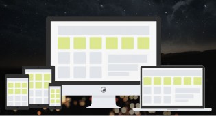
 • Contrast: This technique is diametrically opposite to the technique of integration, based on the philosophy of “hiding in plain sight” using colors that are in direct conflict with those used by the layout of the page.You should not use excessive chromatic colors (fuchsia text on a banner with a white background would be too much), but do use colors that attract attention. Contrast is especially recommended for sites that need a very serious and professional look, as you can see from the graphic. There are no contraindications for using contrast, except those relating to good taste of the combinations that are used.
 • Complementarity: This technique is based on the integration of the two previous techniques. We use complementary colors to the ones used for the rest of the page. For example, if the page has blue writing on a white background, the banner would have a blue background and white lettering. In this way, advertising content will be fully integrated into the site even in color, but it will have the necessary contrast to stand out from the rest of the contents of the website without incurring issues relating to “exploiting” the good faith of the reader. Complementarity does not present any contraindications unless the colors complementary to those chosen for the site layout are particularly irritating to the eye.
The only rule to be respected in the choice of the three techniques is to avoid using too much of anything, thereby making your portal seem unprofessional.
This article was written for YNOT Europe by Eng. Antonio Lodesani. For more information, visit ingoccupati.blogspot.com.
About the Author

admin
YNOT Admin wields his absolute power without mercy. When he's not busy banning spam comments to hell he enjoys petting bunnies and eating peanut butter. He recommends everyone try the YNOT Mail (ynotmail.com) email marketing platform and avoid giving their money to mainstream services that hate adult companies.
Related Posts
-

Traffic Recycling System Monetizes the ‘Back’ Button
BUCHAREST, Romania – Traffic network Brokerbabe has launched a new tool to help webmasters monetize exit traffic across their portfolios or one property at a […]
The Power of Sexual Orientation in Advertising
BERGEN, Norway – All traffic-trading and advertising platforms offer clients ways to target specific markets meeting a plethora of criteria. This one may be a […]
-

Minimum Bid Price Drop Accompanies Site Re-launch
BERGEN, Norway – With the launch of a brand-new website, traffic network PlugRush kicked off a plan to change the way adult businesses view paid […]

Can You Create a Prize-Winning Adult Ad?
BUDAPEST, Hungary – To celebrate its 15th anniversary in cyberspace, a major European producer of classy adult content is seeking a new, mainstream-appropriate advertisement. The […]
Comments are closed.